
When it comes to holiday marketing, visuals aren’t just decoration, they set the tone, stir emotion, and shape how audiences connect with your message. And in no season is this more true than Thanksgiving. From cozy family gatherings to vibrant celebrations of culture, the colors you choose can make your campaign feel warm, joyful, or even luxurious.
At PICHA, we believe visuals are the language of connection. So, let’s dive into a few Thanksgiving color palettes that marketers and creatives can use to tell authentic, impactful stories this season.
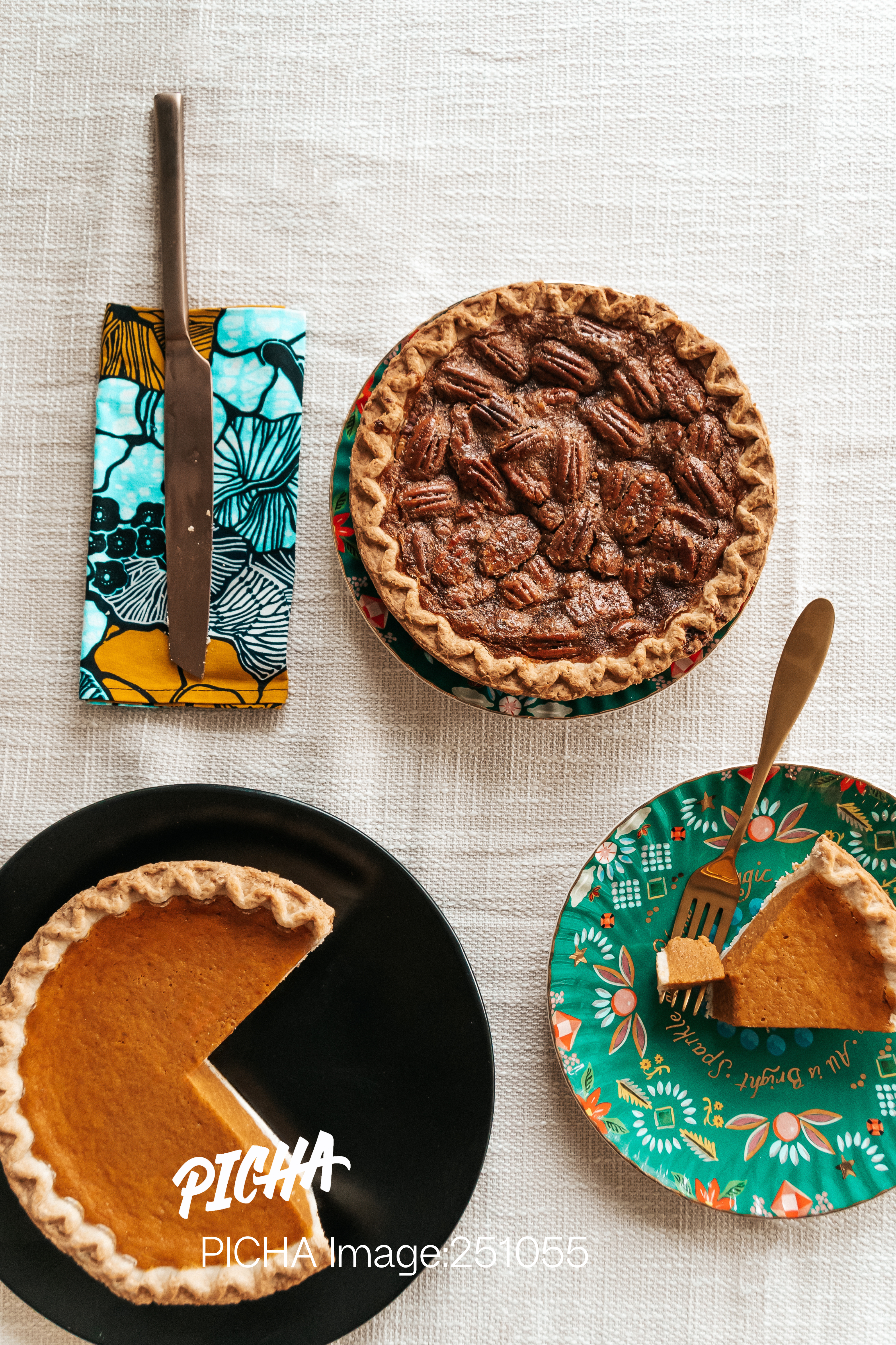
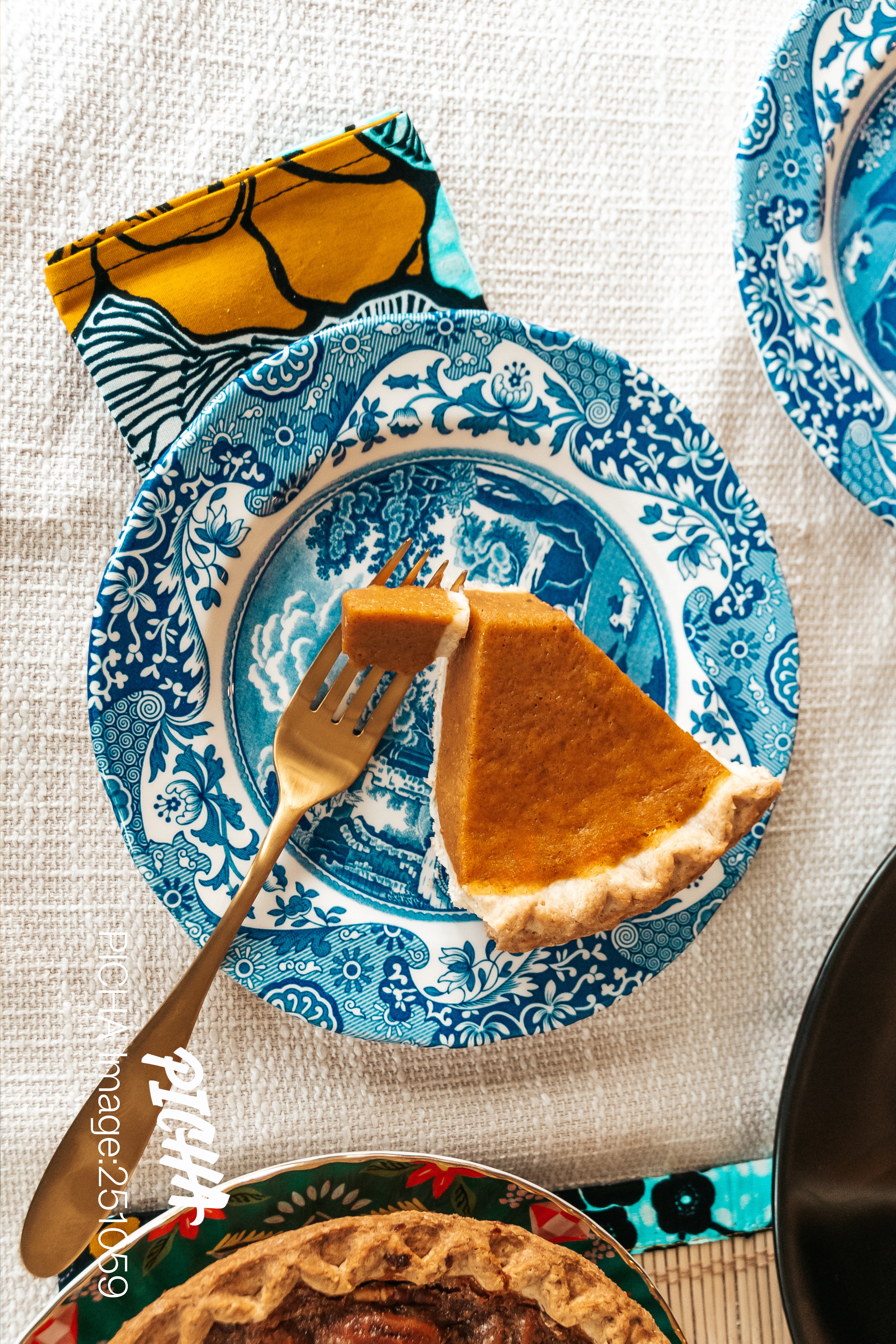
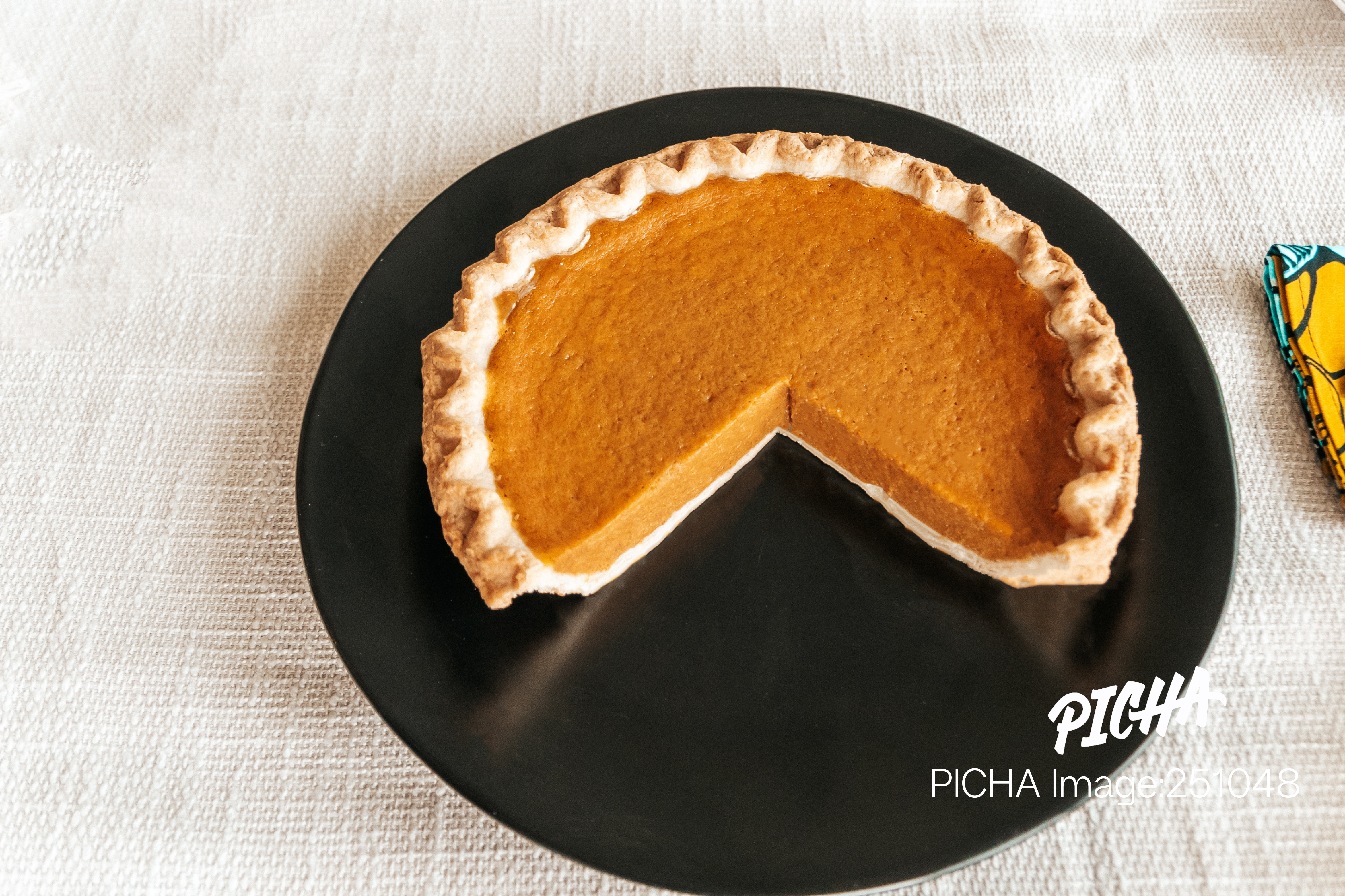
Warm Earth Tones
Think burnt orange, golden yellow, deep brown, and rustic red. These hues instantly signal comfort and nostalgia — the feeling of gathering around a table with loved ones.
Why it works:
- Works beautifully for food brands, retailers, and lifestyle content.
- Evokes tradition and togetherness.
- Perfect for campaigns centered on family, gratitude, and home.
Embrace Bold Patterns
Thanksgiving isn’t one-size-fits-all. Across communities, it’s celebrated with unique traditions, flavors, and aesthetics, bringing cultural depth and modern energy to holiday campaigns.
Why it works:
- Stands out from generic stock imagery.
- Conveys diversity and inclusivity, which today’s audiences deeply value.
- Perfect for brands that want to celebrate culture or reach global audiences.
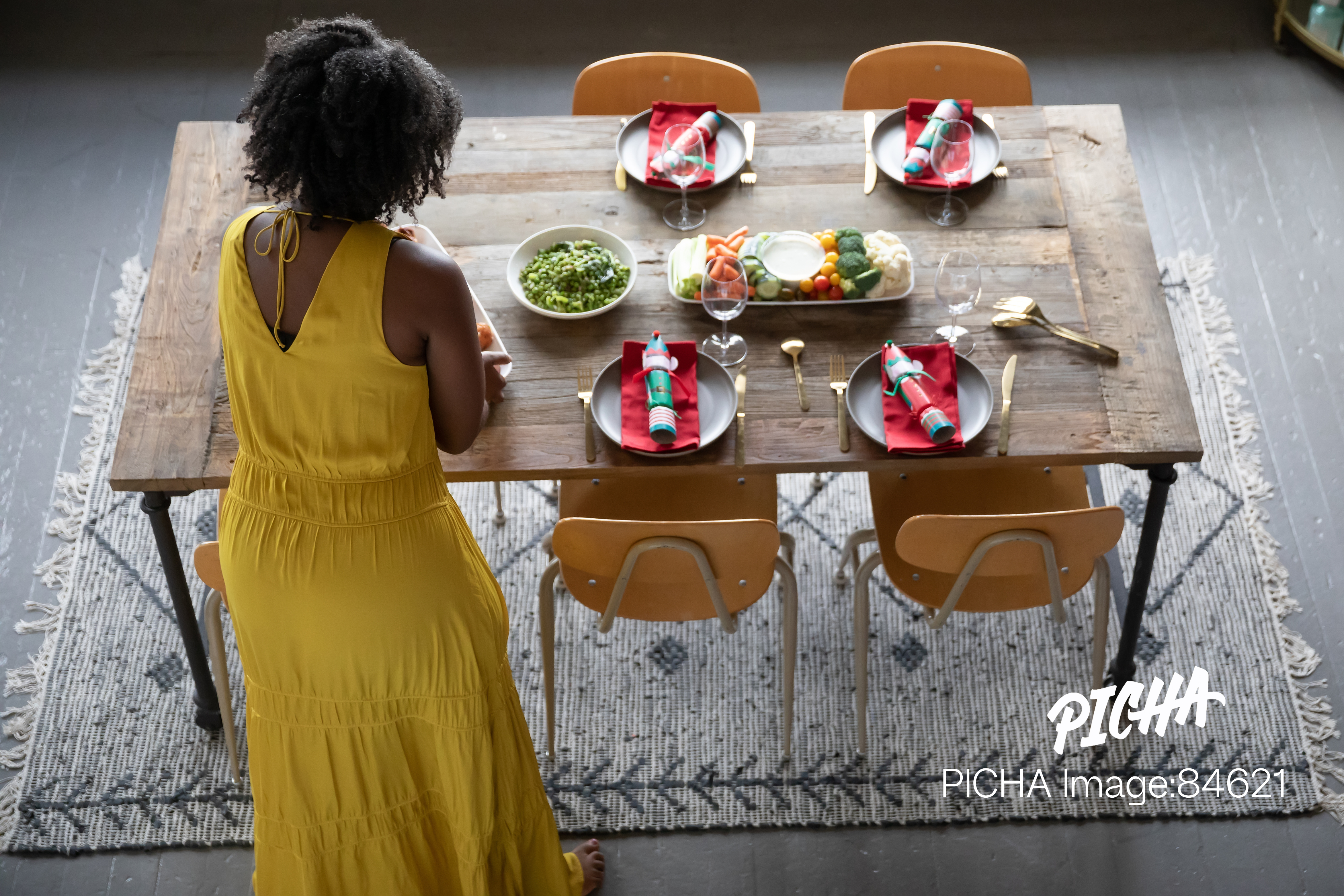
Cozy Neutrals
Soft beige, cream, warm gray, and muted taupe bring a minimalist, modern twist to Thanksgiving visuals. Instead of boldness, this palette whispers calm, intentional living, and sophistication.
Why it works:
- Ideal for brands that lean into lifestyle, wellness, or luxury.
- Appeals to audiences seeking simplicity and elegance.
- Great for editorial spreads, design-driven campaigns, or conscious living content.
This Thanksgiving, don’t settle for generic imagery. Choose visuals that inspire, represent, and connect.

At PICHA, we offer a curated library of authentic, high-quality images designed for marketers, designers, and storytellers who want their campaigns to stand out.